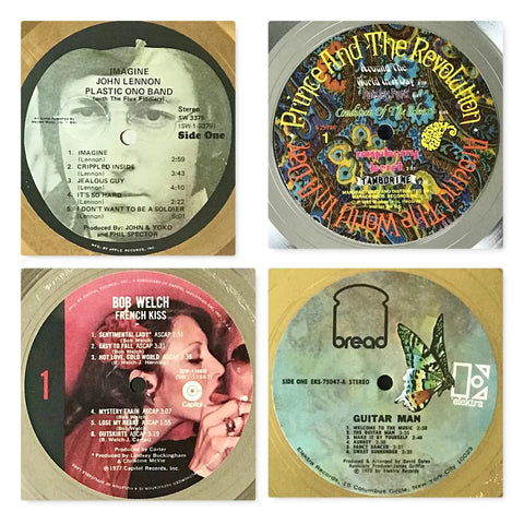
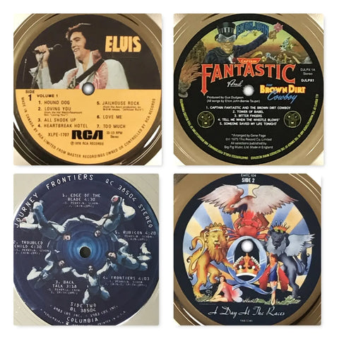
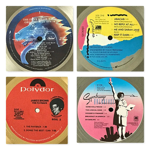
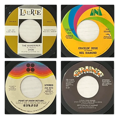
![]() We thought it would be fun to create a pictorial essay of the kaleidoscope of record label designs created over the years. The creative services teams at record labels, composed of artists and graphic designers, were responsible for creating these artworks.
We thought it would be fun to create a pictorial essay of the kaleidoscope of record label designs created over the years. The creative services teams at record labels, composed of artists and graphic designers, were responsible for creating these artworks.
They had to be eye catching, represent both the record label brand and the artist, and do this all in the 3.5" (45s) or 4" (LPs) diameter circle of paper that would get pressed into the hot vinyl of the record during manufacture.
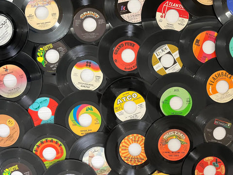
Some labels wanted people to rely on their label for a certain genre of music during certain eras. Atlantic, IRS, Def Jam come to mind as examples of this. Other labels varied their labels by genre of artist or created custom labels for their most successful artists.
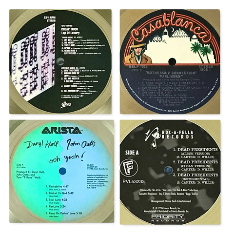
Everyone is familiar with major label record logos and designs. We all grew up with these labels in our record collections. Interestingly though, labels varied by country, year released (first pressing vs. later pressing), and other factors. Some of the labels you see here are from early pressings, some from late, and some are from the U.K. or elsewhere:
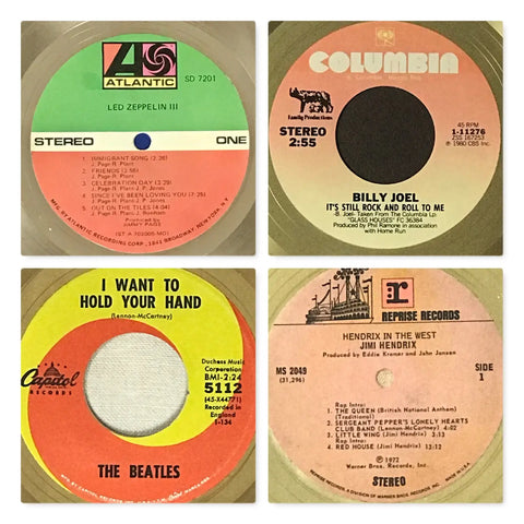
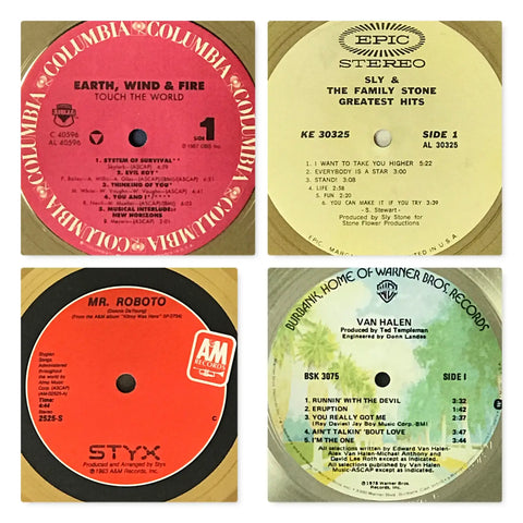
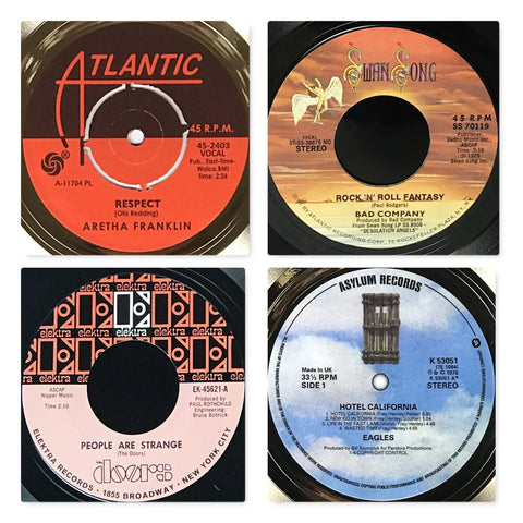




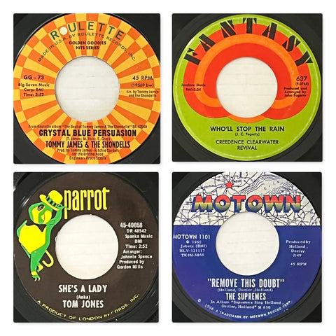
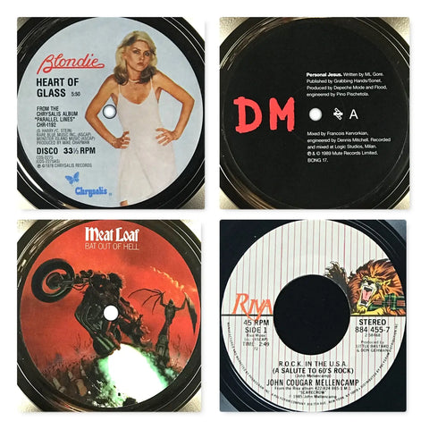
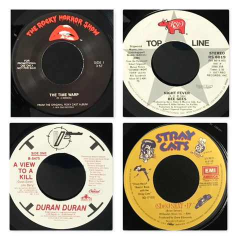
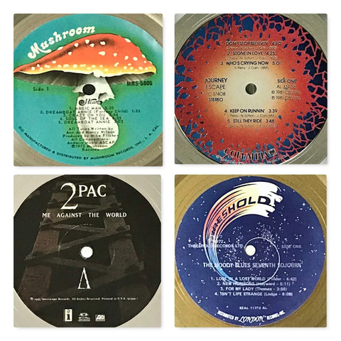
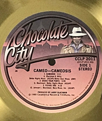
Let's close this article with another one of the best designs ever, the short-lived Chocolate City Records, which was run by Cecil Holmes, Neil Bogart's partner at Casablanca Records:
Check out MusicGoldmine.com's broad selection of vintage record, tapes, CDs, and MiniDiscs here.
*Interested in more content like this? Subscribe to our free bi-weekly newsletter plus get a 15% discount code for music memorabilia from MusicGoldmine.com here.
All images by MusicGoldmine.com


